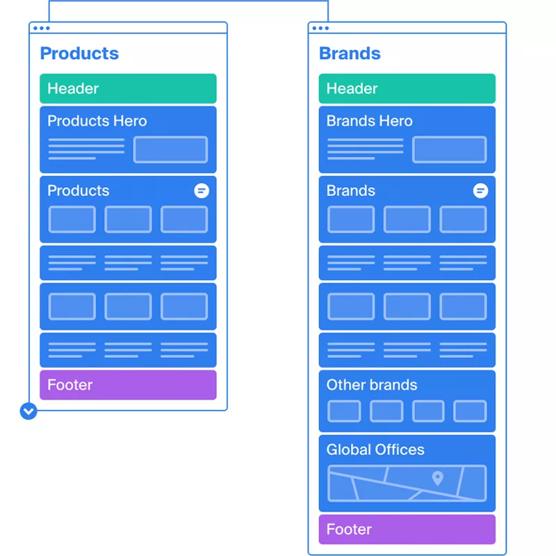
To help American Greetings with their goals, Blackbird advised leveraging Multisite, a WordPress feature that allows you to run multiple WordPress websites from one single codebase.
With WordPress VIP already deployed, we worked with the AG and the VIP teams configure Multisite. We recommended a custom, centralized and shared WordPress theme (UI). Security, plugin compatability.
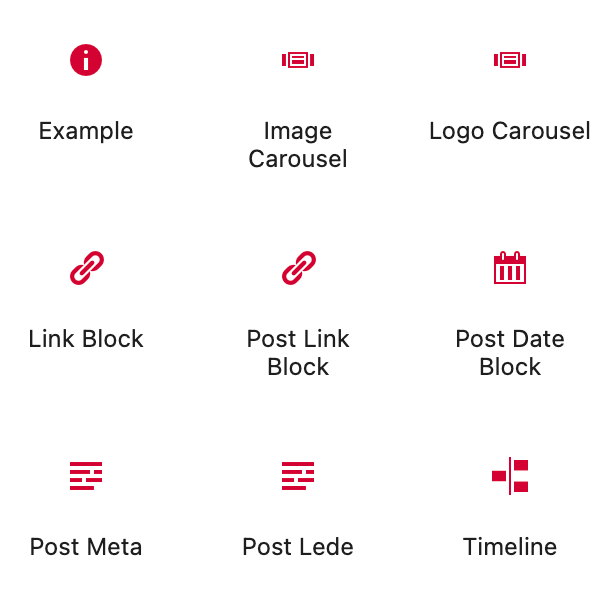
Blackbird also recommended leveraging Gutenberg blocks to develop a system of reusable and dynamic design elements rather than templates, allowing for quick and dynamic page creation by content creators and editors, while ensuring consistency of experience.
Based on the preliminary content requirements, we envisioned a simple yet versatile design system that leveraged many of Gutenberg core blocks. In taking this approach, we can validate ADA compliance across any number site that are using the theme.

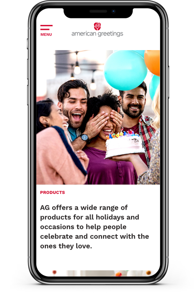
Esthetically, American Greetings sought a dynamic, yet uncomplicated design that conveys the “Celebration Company’s” modern, forward thinking, friendly and inclusive culture.
Still, as century old company, AG didn’t not want to turn its back on its past and how they became the organization they are today.
The American Greetings official color palette is limited by design – red, black and gray. Traditional Helvetica has been the typography standard. Working with AG creative leadership, we determined that extending the palette and exploring more expressive typography options were both on the table.
We worked closely with client content and creative teams collect, organize and prioritize content. We quickly realized that our image assets were one of our strengths. Not only a lot of quality images to leverage, but the archive was deep. We recommended a a “timeline” feature to underscore a long history of growth, change and success.
The American Greetings team was excited to move to WordPress and utilize the powerful block editor, Gutenberg. We developed a custom hybrid theme that handles the details of the header, responsive navigation, and footer, while providing creative freedom for everything in-between. This enables the team to add and rearrange content as needed while keeping the look and feel consistent, thanks to core block styles and variations as well as custom-built Gutenberg blocks for specific features like image sliders and icons. As a brand with a long history, a company timeline was crucial. We built a custom block that handles points on the timeline with core blocks to retain the existing design system while controlling the interactive aspects and layout.
American Greetings is also a global company with international brands that needed a consolidated web presence and style. We accomplished this with WordPress multisite, and designed the theme to standardize styles while allowing for branding customizations. This allowed Carlton Cards, the Canadian branch, to quickly upgrade their site with a similar style, page structure, and brand message.


With our new solution in place, American Greetings has multiple website properties on a single platform, including AG Corporate and Carlton Cards. Content editors create and edit site content with confidence and ease while VIP hardens security and improves performance.
Additional UX needs were identified for Carton Cards/Cartes Carlton (Canada) website. We introduce manual french translation tools and features to give content teams precise editing capabilities without reliance on machine translation. The entire network of websites benefit from improvements like this.
User experience designers. WordPress experts.